Nov 11, 2010
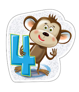
Monkey Mission No9
This was an image created as an adjunct to the Monkey Match books.
A sketch of a book cover, image and typography and book concept. Monkey Mission No9
Labels:
Children's book,
concept,
Monkey Mission No9
Nov 10, 2010
Stone Project, Love hurts doesn't it Cupid
The Stone Project.
My love of Shona sculpture finds it's way into the digital realm. Here Cupid's stinging arrow creates a bit of hurt between the two love birds. Shona sculpture has shown itself as an influence on my artwork from the time of my first children's book in 1995. The picture book Creation was completed with oil paintings of characters inspired by this sculpture. I'll post some of the spreads soon and some more of the Stone Project as well.
Sep 8, 2010
Illustrators Australia 9X5 Exhibition 'Untold stories'
The Illustrator's Australia 9X5 exhibition is upon us. I've just completed and sent my artwork off to Melbourne. It is the 15th annual exhibition and is at Space 39, Level 2, 39 Little Collins St Melbourne 3000. opening night is Friday 17th September @6pm. This show will also travel to Brisbane but I do not know the dates so keep an eye on the IA website.
illustratorsaustralia.com/9X5 2010
This years theme is 'Untold Stories'. My piece is entitled "the forest said, 'don't tell anyone.'
It is in a scraperboard/ woodcut style. I had the image that I wanted to do but did not just want to glue a piece of scraperboard onto the wood. So I played around with some concoctions of gesso and polyfilla to come up with a white ground I could work with. I then experimented with various black coatings, finally using a combination of matt spray coating and a thin dusting of taggers spray paint.
The end process was a lot more laborious than store bought scraperboard but I think the raised surface which is now part of the board gives the piece a bit more soul.
The other artwork is one entitled 'Melchrist' done for the 2005 IA 9X5 exhibition. This one is oil on wood and inspired by Mel Gibson's 'thrashy' Jesus biopic.
Labels:
9X5,
Illustrators Australia,
scraperboard,
woodcut
Aug 6, 2010
Sketchbook 1


This is the first of many postings of some of the sketchbook creations I've done or have been scratching into notebooks and on pieces of paper. I get a lot of joy out of playing around with the human face, looking at linear distortion of it's features to create the unusual character portraits. The format of these has been determined by a set of little photo albums I found at an op-shop near my home. I 'm inspired to fill the four nicely bound books with these 10cmX15cm little sketches. The colour was added in Photoshop using a layer with transparency selected as 'multiply'.
Labels:
portraits,
sketchbook,
sketchheads
Jun 21, 2010

This little fellow is a fox character created for the covers of Oxford University Press' Math Plus primary school workbooks. The original brief was for groovy aliens but changed to a clever inquiring fox detective as the authors were not keen to associate learning maths with being an alien.
I've posted an alien illustration using the characters I had in mind at the time and used in this little tickle the piggy illustration. It has the aliens bringing 'self-awareness' to the little porker with just a touch.
Jun 17, 2010
Redheads are Cats
I have been putting together images this week for Oxford University Press. I've done quite a number of images for their Maths Plus primary mathematics workbooks over the last couple of years.
These images started out as flat characters to supplement the text or explain concepts. I've taken a couple of the characters and gave them a bit of dimension and an entirely different context and environment for them to live in.
Labels:
cat,
mark twain,
Maths Plus,
Oxford University Press,
redhead
Jun 16, 2010
Coffeetime
This image is a combination of two. I was commissioned to create a logo and avatar images for a chatroom site called Coffeetime. The logo appears here along with a sample I created for the Sydney Harbour Foreshore Authority for a promotion to bring more lunchtime officeworkers into the Rocks area of Sydney. Photography was the solution used in the final production but I still love the style of this woman and the 'coffeeness' of the whole.
Jun 1, 2010
TRUE BLUE magazine
This image was created for a Text Pacific Publishing. They produced a magazine called 'True Blue' which if I remember right was an employee magazine for Nestle. This was produced for a fun piece called 'Save me Santa' about remembering some of the trials we go through around the festive time of year. The final printed piece had little type blocks in all the empty spaces.
Labels:
Christmas,
Santa,
Text Pacific,
True Blue
SUDS
'Suds' has come from the reworking of an old image. In the 90's I had been commissioned to create a few characters interacting with water for Sydney's Maritime Museum and their kids' summer-fun waterpark. The images were small vignettes of a character and a prop. I liked the composition of this little fellow here having his bath and was interested always in modernising his look. The original line work was black and the colouring was flat illustrator colours and shading. Here I have created a washroom environment based on my Oma's (Dutch for Grandmother) tiles that I remember from childhood of her bathroom in Canada. I have based the typography on a funky typeface from http://www.pizzadude.dk called 'Cream and Sugar' (Click on 'Suds' title for direct link). This work is unpublished.
May 24, 2010
IA Book 11
Book 11 of the Illustrators Australia is going into production now. Illustrators can upload their page image directly and preview what it will look like immediately.
Book 11 is going to be a swatch book in the same vein as the PMS colour swatch books.
This should allow art buyers a speedier process as they will be able to sift through the artists styles very quickly, picking out what type of imagery is relevant to them at the time.
Contact details and an indication of an illustrators' particular specialties are indicated at the top. These are the images for my page.
Labels:
Book 11,
Illustrators Australia,
swatch
May 20, 2010
Handwriting Made Easy - detail
Detail from Handwriting Made Easy.
I just like this little guy. His boat is just large
enough to accommodate his tail feathers comfortably.
Labels:
bird,
boat,
educational publishing,
handwriting
Handwriting Made Easy
Handwriting Made Easy
This image is one that I have reworked from the straight vector art that was originally published. This image was created for Thomson Nelson Publishing's Handwriting Made Easy series. There were seven versions published. Each used the same image but with a different coloured background for each Australian state. I like this one as the green background 'sea' makes it appear that the characters and their little paperboat are sailing around on a little pond in a rich green plain.
Labels:
bird,
echidna,
educational publishing,
handwriting
Star
Here is another image that came from a similar headspace as the Ophelia image. This one is simply entitled Star.
Illustrators Australia
I've been an active member of our professional association here in Australia (Illustrators Australia) since the NSW illustrators were invited to join up and create a national association back in the late 1980's. The main goal was to create a culture of awareness for illustrators and their clients in regards to artists' rights.
I have been both President and Vice president of the NSW branch working for about five years with my colleague Lew Keilar on behalf of Australian illustrators. FYI: Current President is Christopher Nielsen and Vice President is Nigel Buchanan. Email them at nsw@illustratorsaustralia.com for info.
Have a look at my folio page there as well which will inevitably have images of a different bent to what is published here.
http://www.illustratorsaustralia.com/index.php?option=com_content&task=view&id=5&Itemid=55&user_id=484
Labels:
Buchanan,
Illustrators Australia,
Keilar,
Nielsen,
NSW,
Presidents
1st post - latest image
OPHELIA
Since this is the latest image I was having a play with, I thought it a good one to upload for the start of this blog. This image has been created as a completely digital image. It has started life being built using Illustrator's vectors but then has been finishing using Photoshop.
Subscribe to:
Posts (Atom)


